Welcome to the second installment of the Concept UI series! This time we tried to create a concept design for the editing screen on our very own CMS Okra on mobile devices. Okra's main goal is to make updating websites as easy as possible, and a variety of projects and companies have used Okra. One feature we would like to add is the ability to edit websites from your mobile devices. The UI design is made on sketch, a very useful tool for designing UI for mobile applications.
- SOFTWARE USED
- UI Design : Sketch

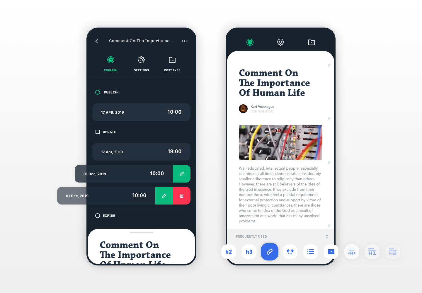
This is our concept design for the article editing screen. On the left is setting screen for article info and the right is the editing screen of the actual article. We must always consider the user's ergonomics when constructing UIUX. Also with the spread of mobile devices, people are now used to mobile-specific functionalities that differ from desktop. For this design, we implemented a layered structure and integrated familiar movements such as swiping.

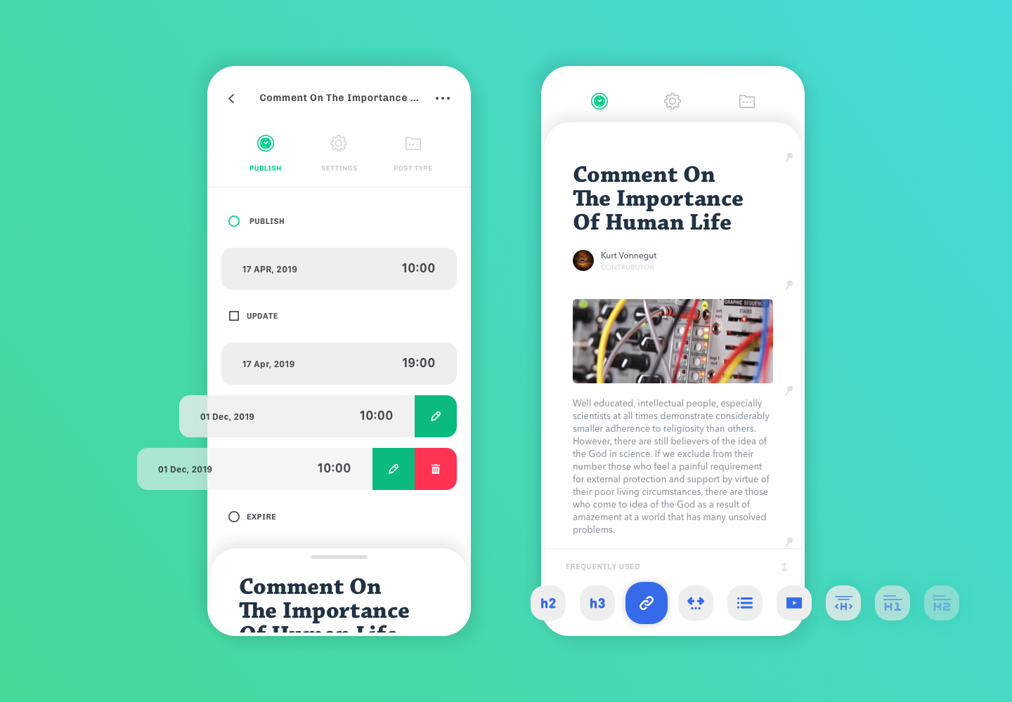
Here is the design for light mode. Since the release of macOS Mojave, we see many design and management tools use dark mode. Our idea of editing an article is the feeling of opening a notebook and unleashing all your ideas on an empty canvas. Of course, having the option to switch between the two is optimal. Dark mode is great for resting your eyes and depending on the color palette of your website, dark mode may look better. A simple yet very important part of application design. 。