- HOME
- Blog
- Web design
- Fonts, Symbols and Me
Fonts, Symbols and Me
Hi there, I'm Yamasaki a designer at Akari. Since this is my first article, I'm gonna talk about some essential fonts and Japanese fonts that are very common in Japan.
About Japanese Fonts
Alright, let's get started. Japanese fonts can be generally categorized with Mincho, Gothic, and Design Typeface. Here are some of the characteristics.
・Mincho font has thicker vertical lines than horizontal lines. The textures are similar to words written with a brush.
・Gothic text appears to have the same size for both horizontal and vertical lines.
・Design Typeface is strong on impact, usually seen as a pop text. Usually used for consumer products and advertisements
※You can see details on Japanese fonts on the Morisawa website
What Should I Focus On?
Many articles discuss the difference and characteristics of these 3 fonts. I tried to think of something that took a different angle at this topic. After some thinking, I thought of "directional marks".
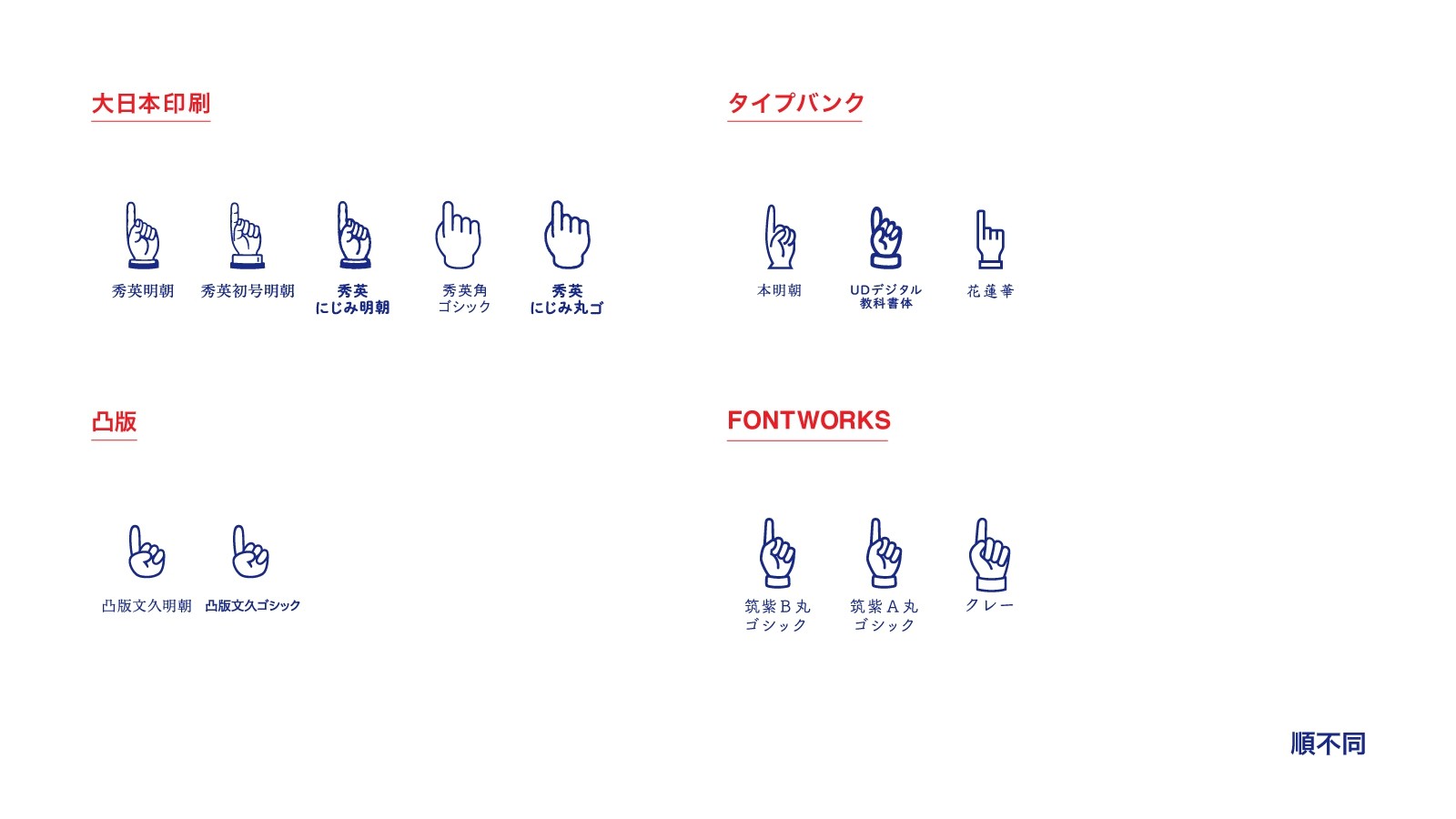
One film I was shocked by was a film by Terayama Shuji. He is known for his unique use of finger arrows. So that was it! I looked at the difference in design for each font regarding directional markers.


Let's Take A Look
For this article, I looked at the markers that were installed on my computer. I looked at the 300 fonts installed and realized there were 3 big categories for directional markers.
・The design of the marker changes when using Mincho and Gothic with...
Typefaces created by DNP
・The design of the marker is not affected by Mincho and Gothic with...
Typefaces created by Morisawa
・The design is unified by designer with...
Kozuka Gothic, and Ryo Gothic ・text・display
Source Hans Sans, Mincho and Noto Sans/Seirf
Unified by Designer
As seen above, some directional markers are unified by the designer. Ryo, Source Hans Sans, and Noto are created by typeface designer Nishizuka Ryoko. I speculate the reason why Ryo and Kozuka have the same design is because Nishizuka is influenced by typeface designer Kozuka Masahiko.
The directional marker for Tenmincho designed by Nishizuka really stood out to me, since it is designed after the paw of a ten (marten)
Lastly
I really felt the connection between Kozuka Masahiko and Nizuka Ryoko during writing this article. It was highly interesting to see not only from a design standpoint but a behind the scenes of the creation of the font as well. We see fonts everyday but it really is a rabbit hole once you get hooked.
I hope you found this article interesting and I hope to write another one in the near future!